Creating an effective landing page for a sales campaign involves strategic thinking, especially when it comes to hosting and design.
With this in mind, the VA’s dilemma comes as no surprise; while stand-alone pages are preferred for their SEO benefits, utilising a CRM can offer incredible advantages in landing page design, campaign management, tracking, and more.
So, what’s the best option? What will deliver the best results for your client?
Let’s dive in.

First things first: what is a landing page?
A landing page is a standalone web page created specifically for a digital marketing or advertising campaign.
Essentially, it’s where a visitor “lands” after clicking on a link, and the primary goal is to convert visitors into leads or customers by encouraging them to take a specific action, like filling out a form, making a purchase, or signing up for a newsletter.
What does a high-converting landing page look like?
In our opinion, there are ten steps to building a high-converting landing page:
- A compelling heading: The goal is to grab visitors’ attention early—if not immediately. The landing page should clearly convey the value of your client’s campaign and ideally match the ad or link the visitor clicked to get there.
- An engaging subheading: Provide additional information to support the headline here. Still, keep it short, punchy, and above the fold (i.e. the visitor shouldn’t have to scroll down to get the full message).
- Visual elements: Add high-quality images and/or videos highlighting the products or services offered. For example, if your client is selling a clever new product, add an interactive, clickable diagram highlighting top-selling features or a promotional and instructional video.
- Benefit-oriented content: Ensure the page copy focuses on the benefits and value of the product or service, addressing the visitor’s pain points (and how you can solve them).
- A call to action (CTA): Add clear, prominent buttons or links encouraging visitors to take action (e.g. “buy now”, “sign up”, “get started”).
- A form: If lead generation is your client’s goal, include a contact form to capture visitor information (e.g. name, address, phone number).
- Trust elements: To build credibility with visitors, add customer testimonials, reviews, case studies, or logos of trusted brands.
- Limited navigation: There should be minimal or no links to other pages. Keep your eye on the prize and ensure visitors are focused on reaching the landing page’s goal (e.g. making a purchase).
- Urgency: Urgency is key in the e-commerce space. Add limited-time offers, countdown timers, or stock indicators to encourage immediate action.
- A mobile-friendly design: 93% of people use their phone to access the web, so creating a mobile-friendly landing page is essential.
Example landing pages that nail the brief
Want an example to see what all the fuss is about? Check out Netflix Australia.
Straight off the bat, you’re presented with the platform’s key benefits: “unlimited movies, TV shows, and more” and “what anywhere, cancel any time,” followed by a call to action.
Another example is Linkedin Premium. When you land on the page, you’re presented with compelling offers, like “one month free” and “save up to 50% on an annual plan”, as well as benefits like “stand out for 2x more opportunities with the help of AI”.
Plus, there are CTAs galore, making it easy to convert at multiple points across the page.
CRM hosting vs a brand new page on-site: what’s better?
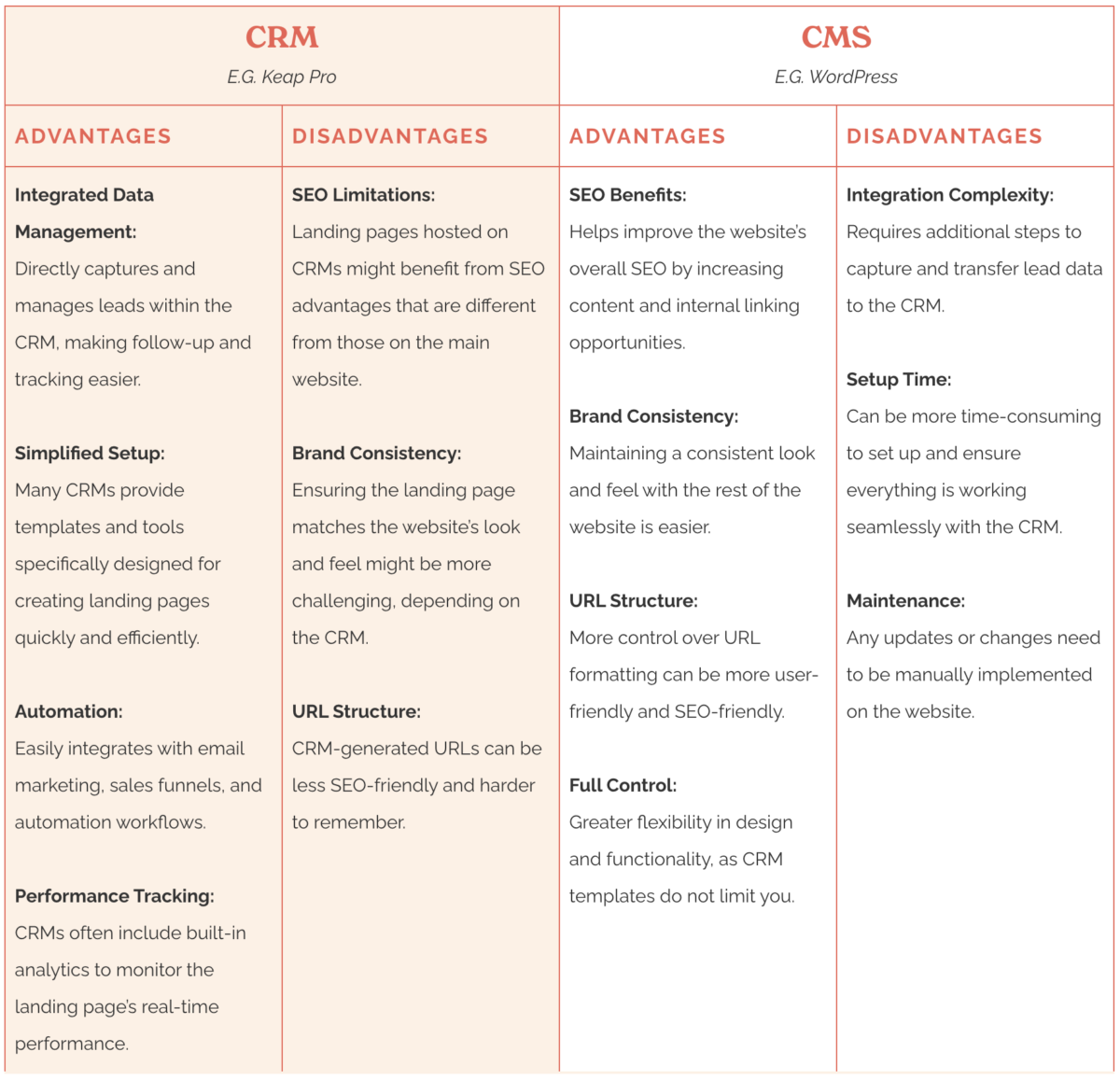
Hosting a landing page on a CRM (Customer Relationship Management) and setting it up as a stand-alone page on your client’s CMS (Content Management System) both have advantages and disadvantages.
Let’s take a look!

If your client prioritises SEO, building a stand-alone page on their website might be the solution.
So long as the content is well-optimised for relevant keywords, the page’s visibility in search engine results will improve.
If your client doesn’t prioritise SEO, we recommend utilising a CRM for quick and simple set-up, data integration, and automation.
For example, if the goal is to maximise sales/enquiries ASAP, a CRM-hosted landing page will be faster to set up and more effective with paid advertising campaigns through platforms like Meta and Google Ads.
What’s the best landing page builder for my client?
It sounds like your client already uses a CRM with a landing page builder similar to Keap Pro (read our full review and get free training for that one here).
For other readers of Val’s blog looking for a landing page builder with CRM integration capabilities, we’re here to help!
Check out our list of pros and cons for some of the best landing page builders on the market:
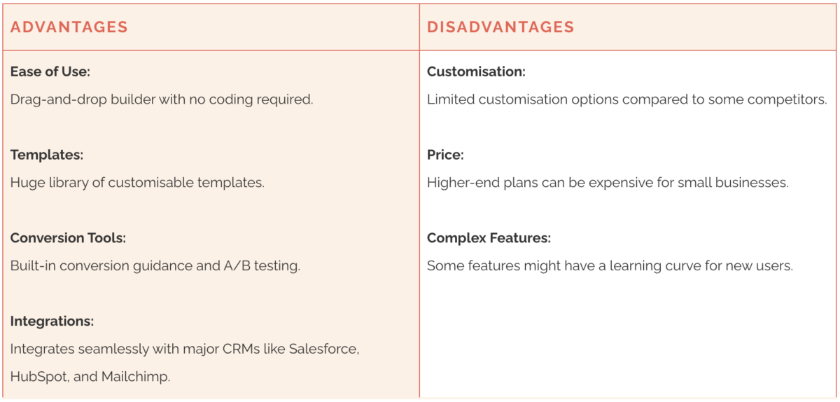
Beginner: LeadPages
LeadPages is a popular landing page builder known for its user-friendly interface and extensive template library, making it a brilliant option for beginners.
It’s designed to help businesses create high-converting landing pages quickly and efficiently.

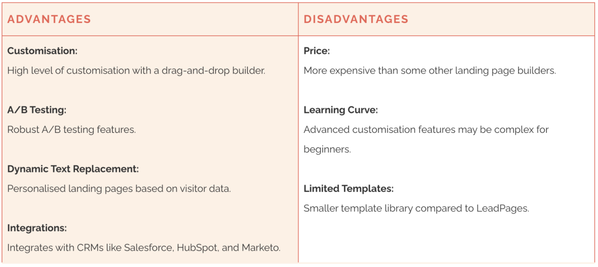
Intermediate: Unbounce
Unbounce is a landing page platform focused on helping businesses build, publish, and test landing pages without the need for developers.
In our opinion, this is the best option for advanced customisation and A/B testing but is better suited for more experienced users.

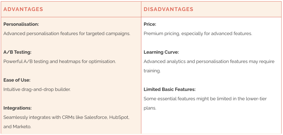
Advanced: Instapage
Instapage specialises in creating high-converting landing pages that focus on personalisation and optimisation. This is a good option if you’re focused on achieving and maintaining a high conversion rate, but you may need training if you’re new to landing page builds.

Need a hand building a landing page? Subcontract the task to an experienced VA!
Setting up an effective, optimised landing page can be time-consuming and technically challenging.
There’s no shame in subcontracting the task to another virtual assistant with more experience; in fact, this will guarantee a professional, efficient, and seamless setup for your client while you focus on the more important stuff!
Leverage the expertise of your fellow virtual assistants to create a high-converting landing page that meets your client’s objectives.
